From the presentation I gave this weekend at the Phoenix Desert Code Camp. You can also view and download the notes at http://bit.ly/cssforlayout
Why Use CSS?
Cascading style sheets (CSS) allow us to separate content from presentation.
- Saves time and money. It's easier to change one style sheet than, say, 20 font tags on every page of a 200 page web site.
- File sizes are smaller and load faster, saving more time, money and your users from frustration.
- Machines love it because...
Machines don't care what a page looks like, only that it makes logical sense.
HTML is intended to tag content with meaningful labels so that machines know what the bits of data are. Browsers are not the only machines that access your pages. Devices such as handhelds, mobile devices, text readers, screen readers, bots, spiders, search engines, feed readers, data scrapers, etc., will pull (or push) your content. The data must be identified in a logical, meaningful way. Information about the visual display of those elements is junk to machines.
SEMANTIC MARKUP
Writing semantic markup ensures that your content can be consumed by almost every method and machine accessing the web, and that those machines can repurpose and display the content in a suitable manner.
There's no secret or difficulty in writing semantic markup. Just call things what they are.
- Lists - use
UL, OL,orDL - Heads - label
H1(only once per page),H2, H3, etc., in a logical hierarchy - Paragraphs - wrap paragraphs in
Ptags. - Divs and spans - are gimmes from W3C. Generic style containers with no visual or presentational attributes of their own, they are used to style or layout content when no other HTML element is available. As "meaningless" tags, they are ignored by most machines.
Never use HTML to indicate how something should be displayed in a browser. For most machines, that's junk code.
All About Boxes
In CSS every element is a box. To understand CSS, you need to understand the box model, the types of boxes, and the flow of elements in a document.
The Box Model
Margin adds spacing outside the element, padding adds spacing inside the element. Borders fall between.
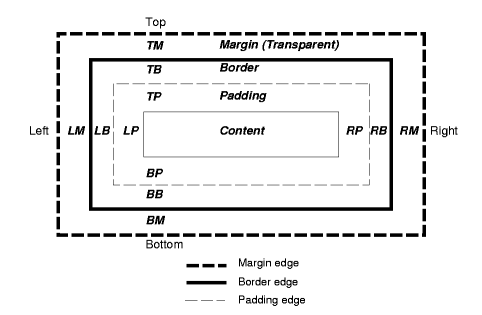
From W3C's "Visual formatting model" http://www.w3.org/TR/CSS2/visuren.html
The size of a box is calculated as:
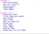
content + margin + padding + border = size (width or height)If we have content with a width of 200px, right and left margins of 10px, right and left padding of 20px, and a 1px border, the width of the box would be 262px:
200px + (2 x 10px) + (2 x 20px) + (2 x 1px) = 262pxWhen calculating sizes, keep in mind a strange characteristic of margins. When margin bumps up to other margin, it collapses into the larger margin. (Padding never collapses.) There is a good reason for this. Margins are used on paragraphs, so this keeps the spacing between paragraphs consistent.
Browser Resets
Every browser has defaults set by the manufacturer for displaying elements. Most software providers try to comply with the W3C standards, but some have dragged their feet a bit. We can use a reset method to remove the default styling browsers put on the elements and bring them all back in line.
Eric Meyers' Browser Reset: really good at removing all styling:
html, body, div, span, applet, object, iframe, h1, h2, h3, h4, h5, h6, p, blockquote, pre, a, abbr, acronym, address, big, cite, code, del, dfn, em, font, img, ins, kbd, q, s, samp, small, strike, strong, sub, sup, tt, var, dl, dt, dd, ol, ul, li, fieldset, form, label, legend, table, caption, tbody, tfoot, thead, tr, th, td { margin: 0; padding: 0; border: 0; outline: 0; font-weight: inherit; font-style: inherit; font-size: 100%; font-family: inherit; vertical-align: baseline; } /* remember to define focus styles! */ :focus { outline: 0; } body { line-height: 1; color: black; background: white; } ol, ul { list-style: none; } /* tables still need 'cellspacing="0"' in the markup */ table { border-collapse: separate; border-spacing: 0; } caption, th, td { text-align: left; font-weight: normal; } blockquote:before, blockquote:after, q:before, q:after { content: ""; } blockquote, q { quotes: "" ""; }Global reset: removes margins and padding on all elements (*):
* { margin: 0; padding: 0; }NOTE: Removing margins on the ul doesn't remove the style: disc rule. They're just hidden. We need to add list-style-type: none.
Box Types: Block & Inline
In CSS there are two types of boxes: block and inline.
Block-level elements
Block level elements are normally displayed as blocks with line breaks before and afterwards. By default block-level elements are the width of their parent (or ancestor containing) item and cannot have elements at their side. In the normal flow of the document, sibling blocks "stack." Think of sibling blocks as boxes stacked on one another, or rectangular pieces of paper laid out in a vertical row.

Block elements can contain descendent, or child, blocks inside themselves, but not alongside. Think of parent and descendent blocks as boxes set within one another, or pieces of paper placed on top of one another.
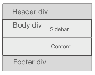
Examples of block-level elements include: <div>, <h1>...<h6>, <p>, <ul>, <ol>, <dl>, <li>, <table>, <blockquote>, <form>, <button>
Inline elements
By default inline-level elements create a "mini" block within a line of text and do not break up the flow of that line. Inline elements can exist inside block elements, but never the other way around.
<span><div>Never do this!</div></span>Here, <p> generates a block box, with several inline boxes inside it.
<p>Some <em>emphasized</em> and <span>other</span> text.</p>Two or more inline elements will stack sideways, starting from the left and extending to the right. If they are wider than the containing element, they will wrap. Inline elements can't be given a width or height. They will only take left and right padding and margins, never top and bottom. Examples of inline-level elements include: <span>, <a>, <strong>, <em>, <img>, <abbr>, <acronym>, <cite>, <small>, <sub>, <textarea>
Conclusion: The good news
Block and inline elements can be styled. We can change:
- font colors, sizes, families, styles, weights, and more
- give block elements heights and weights
- put background colors or images on them
- move them around the page
Positioning Schemes (Layout)
There are three ways to layout or position a block in CSS:
- Normal flow: This is the default flow of documents. Boxes are stacked on one another, beginning at the top of a containing block.
- Floats: A box is first laid out according to the normal flow, then taken out of the flow and shifted to the left or right as far as possible. Content may flow along the side of a float.
- Absolute positioning: A box is removed from the normal flow entirely (it has no impact on later siblings) and assigned a position with respect to a containing block.
Float
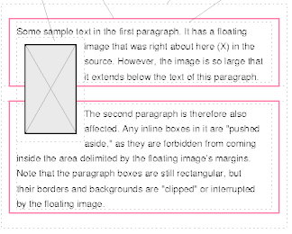
You can float elements left or right. They also take the value "none." The odd thing about floats is that, when you float something, it's almost but not entirely removed from the normal flow of the document. Other content "flows around" it. In fact, floats were intended to allow for text to flow around floated elements like images and to float elements side-by-side, such as a horizontal navigation list of block-level li boxes.
Content below will wrap around a floated element, while border, background image and background color will extend underneath.
Floating a block left causes content to flow around it.
From W3C's "Visual formatting model" http://www.w3.org/TR/CSS2/visuren.html
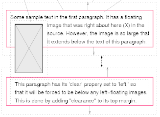
If you don't want a block to wrap, you can apply the clear property to the element using clear: left, clear: right or clear: both.
The second paragraph has a clear: left on it.
From W3C's "Visual formatting model" http://www.w3.org/TR/CSS2/visuren.html
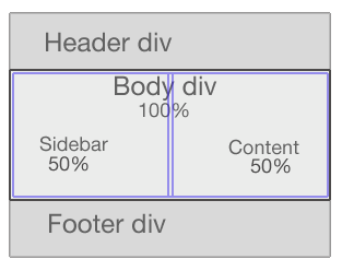
To float two blocks side-by-side, you must make room for them by explicitly stating a width on the blocks. In the example below, putting a width of 50% on both boxes and a float: right on the preceding content box causes the following sidebar box to "flow" around the content box and into the "empty" space.
Floats are often used for layout, but they were not originally intended for that purpose. In fact, that role goes to the CSS property called "position."
Position
All elements have default position value of "static," although this is generally thought of as "unpositioned" and is never really stated because it's default. You can give elements three types of positions: relative, absolute, and fixed. "Position" is a powerful property and can be used to do all kinds of crazy and wonderful things in laying out web pages.
Position: relative
The relative value is actually exactly what it sounds like--elements are positioned top, bottom, right or left relative to their current position. Relatively positioned elements are offset, and the space they would have occupied is retained. In the normal document flow, block boxes stack.
We can reposition the third paragraph relative to its current position in the flow by adding postion: absolute and the properties top and left:
p {position: absolute; top: 20px; left: 20px;}Notice the fourth paragraph respects the space the third paragraph occupied.
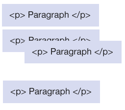
In situations where the size of the blocks is not known, the "relative" position may change. For this reason, relative positioning is good for minor page adjustments, but should probably not be used for major layout.
Position: absolute--The Queen of Layout
Absolutely positioned elements act differently than any normally flowed elements.
With absolute positioning, the top, right, bottom, and left properties are in relation to a parent element. The parent element can be a containing block with a position: anything tag on it. If there's no positioned ancestor element, the parent is the document itself--in most browsers this means the <html> tag.
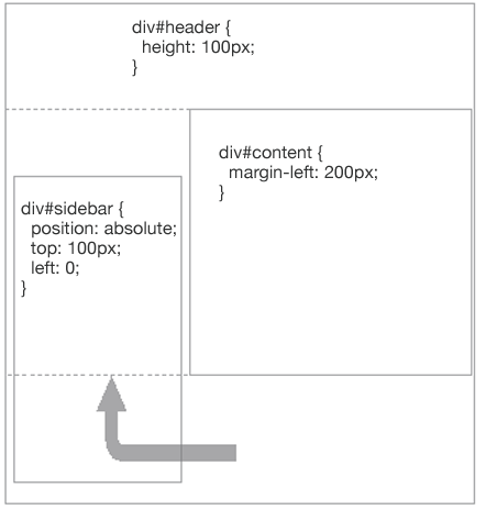
An element with position:absolute is removed from the document flow. The rest of the document acts as if the element weren’t there. It could easily end up layered over other elements, unless we make sure it doesn’t.
The first absolute positioned div is covered by the second absolute positioned div by default. 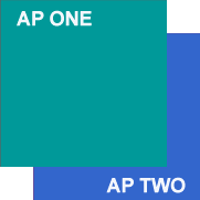 |
Adding a higher z-index to the second absolute positioned div causes it to be positioned higher in the stack.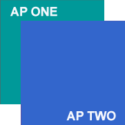 |
From "Big John" Gallant's "The difference between 'The Flow' and 'Positioning' for Web Pages" http://bit.ly/aIdZAj
Finally, by default, absolutely positioned elements shrink-to-fit their widths (and heights) around any child elements they may hold.
Resources
- The Specs (a.k.a. "Cascading Style Sheets Level 2 Revision 1 (CSS 2.1) Specification")
- CSS: The Definitive Guide, 3rd ed., by Eric Meyer (O'Reilly)
Learn from the Best
- CSS Zen Garden
- Position Is Everything and Gallant's article at http://bit.ly/aIdZAj
- CSS-Discuss Wiki - founded by Eric Meyers in 2002
- A List Apart (Layout articles)
- Max Design Floatutorial
Layout Repositories
* Google 'css layout' for hundreds more